Glisten
Glisten
Glisten
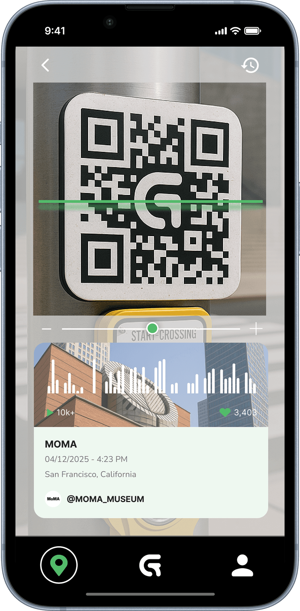
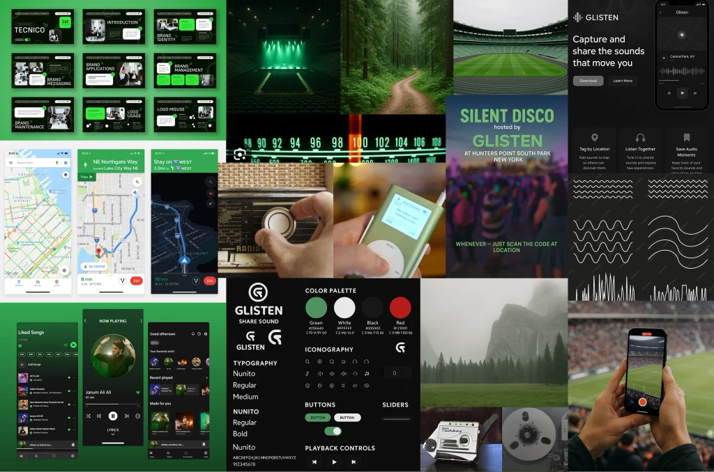
Glisten is a mobile app centered on capturing, tagging, and sharing personal audio moments tied to real-world locations.
I led the full design effort, from rediscovery and user flows to branding and high-fidelity prototyping. As the sole designer, I leveraged AI tools to streamline and support multiple stages of the design process. This project also gave me the opportunity to explore end-to-end AI design platforms and assess how they can support a one-person team.
Role
Role
Product Designer, Researcher, Brand and Visual Design
Product Designer, Researcher, Brand and Visual Design
Challenge
Challenge
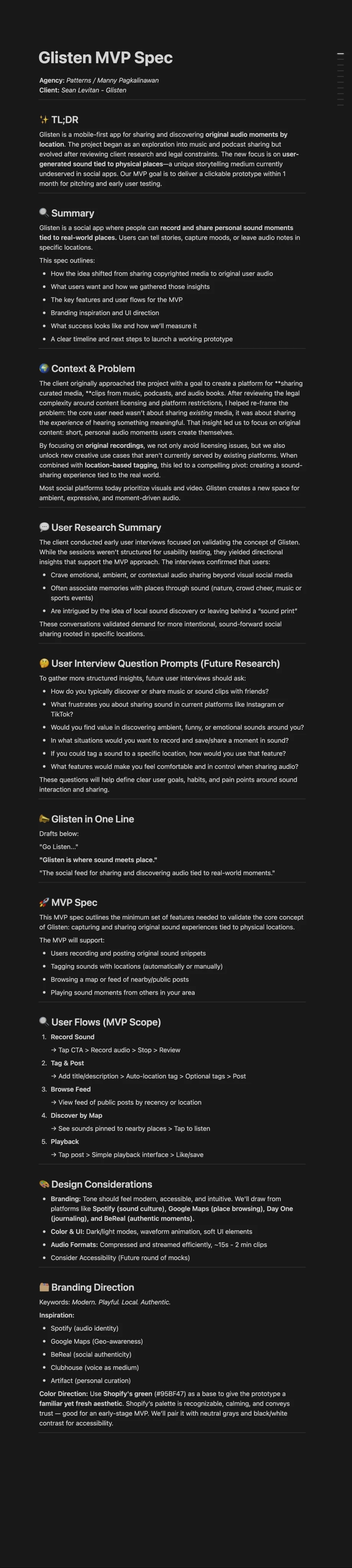
An open-ended idea to share clips from music, audiobooks, and podcasts needed direction and clarity. Though user interest was validated through research, the concept faced challenges like media rights and API limitations. The client needed to distill the experience to a few core features that would best communicate the concept.
An open-ended idea to share clips from music, audiobooks, and podcasts needed direction and clarity. Though user interest was validated through research, the concept faced challenges like media rights and API limitations. The client needed to distill the experience to a few core features that would best communicate the concept.
Solution
Solution
Through collaboration and research, we landed on an app where users could record audio moments, tag them to a place, and share them with others. The pivot unlocked opportunities for storytelling, tourism, accessibility, and community building.
Redesigned the Talent Search Page to deliver a more intuitive and efficient candidate management experience. Our strategy reduced friction, enhanced search and filtering capabilities, and modernized the Ul, empowering sourcers to uncover high-quality candidates with ease.
Through collaboration and research, we landed on an app where users could record audio moments, tag them to a place, and share them with others. The pivot unlocked opportunities for storytelling, tourism, accessibility, and community building.

Glisten: Location Based Audio Sharing App
Glisten: Location Based Audio Sharing App
Glisten: Location Based Audio Sharing App


Deliverables & Impact
Deliverables & Impact
Deliverables & Impact
I guided the client through the UX design process, introducing core practices, framing problems around user needs, and keeping the project organized from kickoff to delivery. Together, we focused on defining the desired experience by clarifying the why, identifying the audience, and establishing ways to test the concept. This process helped the client articulate their vision and pitch it with confidence.
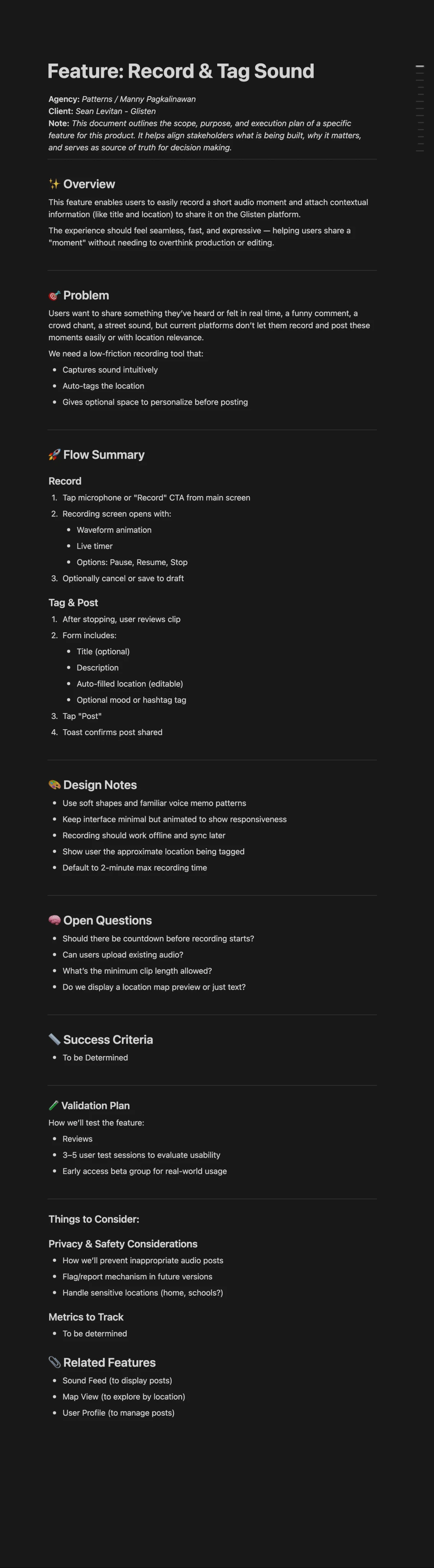
Deliverables included: Clickable Figma prototype, Simplified MVP concept, Clear feature specifications, and User flows
I guided the client through the UX design process, introducing core practices, framing problems around user needs, and keeping the project organized from kickoff to delivery. Together, we focused on defining the desired experience by clarifying the why, identifying the audience, and establishing ways to test the concept. This process helped the client articulate their vision and pitch it with confidence.
Deliverables included: Clickable Figma prototype, Simplified MVP concept, Clear feature specifications, and User flows
Demo: Built in Figma
Demo: Built in Figma
Process
Process
My approach prioritized efficiency, collaboration, and clarity, which was especially important with a short timeline and a solo design role. I combined AI-driven tools with hands-on design practices that enabled me to explore broadly, iterate quickly, and ensure the work stayed focused on both user needs and the client’s goals.
My approach prioritized efficiency, collaboration, and clarity, which was especially important with a short timeline and a solo design role. I combined AI-driven tools with hands-on design practices that enabled me to explore broadly, iterate quickly, and ensure the work stayed focused on both user needs and the client’s goals.
My approach prioritized efficiency, collaboration, and clarity, which was especially important with a short timeline and a solo design role. I combined AI-driven tools with hands-on design practices that enabled me to explore broadly, iterate quickly, and ensure the work stayed focused on both user needs and the client’s goals.

Collaboration & Documentation
Collaboration & Documentation
Collaboration & Documentation
Working Transparently – How I Organized the Project for Shared Visibility
To keep both my thinking and the project’s progress visible and aligned, I created a shared Notion workspace for the client. This included:
A running archive of design decisions
Interview takeaways and research notes
Meeting notes and discussion threads
Competitive and market research summaries
MVP and feature breakdowns
This space served as both a central source of truth and a way for the client to understand not just what was being designed, but why.
Moving from Strategy to Execution
Moving from Strategy to Execution
With goals in place and a shared workspace established, I transitioned into the next phase of design, where early structure and direction began to take shape. AI tools helped me accelerate research synthesis, visualize potential user flows, and quickly generate layout directions. This allowed me to move faster through exploration and decision-making.
With goals in place and a shared workspace established, I transitioned into the next phase of design, where early structure and direction began to take shape. AI tools helped me accelerate research synthesis, visualize potential user flows, and quickly generate layout directions. This allowed me to move faster through exploration and decision-making.
With goals in place and a shared workspace established, I transitioned into the next phase of design, where early structure and direction began to take shape. AI tools helped me accelerate research synthesis, visualize potential user flows, and quickly generate layout directions. This allowed me to move faster through exploration and decision-making.


Research & Rediscovery
To bring more clarity and structure, I used AI tools to synthesize and extract themes around how users relate to sound, memory, and place. Comparing insights across tools helped validate assumptions and uncovered opportunities. Using these tools saved hours of manual transcription, sticky-note clustering, and affinity mapping which allowed me to get to a direction faster.
I reviewed early notes and interviews shared by the client, which largely reflected their initial assumptions. To bring more clarity and structure, I used AI tools like UX Pilot and FigJam’s built-in synthesizer to extract themes around how users relate to sound, memory, and place. Comparing insights across tools helped validate assumptions and uncovered opportunities to shift away from licensed media toward more personal, place-based audio moments. Using these tools saved hours of manual transcription, sticky-note clustering, and affinity mapping which allowed me to get to a direction faster.
To bring more clarity and structure, I used AI tools to synthesize and extract themes around how users relate to sound, memory, and place. Comparing insights across tools helped validate assumptions and uncovered opportunities. Using these tools saved hours of manual transcription, sticky-note clustering, and affinity mapping which allowed me to get to a direction faster.
Journey Mapping & Flow
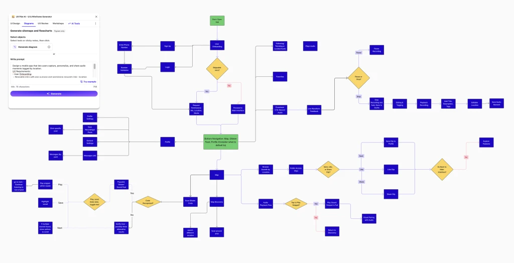
Using insights from discovery, I mapped key user actions into core flows, like recording, tagging, and sharing sound. To build on this structure, I used UX Pilot’s flowchart generator, inputting key user scenarios and functional goals. The AI outputs provided a solid foundation but still needed refining. Nonetheless it helped identify which flows to prioritize in the prototype.
Using insights from discovery, I mapped key user actions into core flows, like recording, tagging, and sharing sound. To build on this structure, I used UX Pilot’s flowchart generator, inputting key user scenarios and functional goals. The AI outputs provided a solid foundation but still needed refining. Nonetheless it helped identify which flows to prioritize in the prototype.
Using insights from discovery, I mapped key user actions into core flows, like recording, tagging, and sharing sound. To build on this structure, I used UX Pilot’s flowchart generator, inputting key user scenarios and functional goals. The AI outputs provided a solid foundation but still needed refining. Nonetheless it helped identify which flows to prioritize in the prototype.

Wireframing
Building on the journey mapping work, I used UX Pilot’s wireframe generator to rapidly visualize key screens across core flows. This allowed me to explore layout variations quickly without starting from scratch. The outputs weren’t perfect, but they gave me a strong visual foundation I could refine and translate into Figma. This freed up time for interaction design, motion, and aligning the final UI with the brand direction.
Building on the journey mapping work, I used UX Pilot’s wireframe generator to rapidly visualize key screens across core flows. This allowed me to explore layout variations quickly without starting from scratch. The outputs weren’t perfect, but they gave me a strong visual foundation I could refine and translate into Figma. This freed up time for interaction design, motion, and aligning the final UI with the brand direction.
Building on the journey mapping work, I used UX Pilot’s wireframe generator to rapidly visualize key screens across core flows. This allowed me to explore layout variations quickly without starting from scratch. The outputs weren’t perfect, but they gave me a strong visual foundation I could refine and translate into Figma. This freed up time for interaction design, motion, and aligning the final UI with the brand direction.
Wireframing
Exploring Visual Direction
Before moving into high-fidelity mockups, it was important to align on the visual tone and brand direction. This was one of the more creative and expressive phases of the project. The client and I collaborated closely using mood boards, visual references, and shared aesthetic cues to shape the app’s personality. This made it easier to carry consistency and tone into the mockups that followed.
I reviewed early notes and interviews shared by the client, which largely reflected their initial assumptions. To bring more clarity and structure, I used AI tools like UX Pilot and FigJam’s built-in synthesizer to extract themes around how users relate to sound, memory, and place. Comparing insights across tools helped validate assumptions and uncovered opportunities to shift away from licensed media toward more personal, place-based audio moments. Using these tools saved hours of manual transcription, sticky-note clustering, and affinity mapping which allowed me to get to a direction faster.
Before moving into high-fidelity mockups, it was important to align on the visual tone and brand direction. This was one of the more creative and expressive phases of the project. The client and I collaborated closely using mood boards, visual references, and shared aesthetic cues to shape the app’s personality. This made it easier to carry consistency and tone into the mockups that followed.

Applying Visual Styling
With a visual and brand foundation in place, I used UX Pilot’s page generation tool to apply our design direction to early layouts. I crafted prompts based on our shared documentation and uploaded relevant style references to guide the outputs. The resulting screen variations reflected the clients vision, giving them an early look at how the system could scale across flows.
With a visual and brand foundation in place, I used UX Pilot’s page generation tool to apply our design direction to early layouts. I crafted prompts based on our shared documentation and uploaded relevant style references to guide the outputs. The resulting screen variations reflected the clients vision, giving them an early look at how the system could scale across flows.
With a visual and brand foundation in place, I used UX Pilot’s page generation tool to apply our design direction to early layouts. I crafted prompts based on our shared documentation and uploaded relevant style references to guide the outputs. The resulting screen variations reflected the clients vision, giving them an early look at how the system could scale across flows.
Working with AI
Working with AI
UX Pilot helped establish early flows and screen ideas, but its limitations in prototyping and interaction design led me to switch to Figma. There, I refined layout, hierarchy, and interaction details to deliver a polished demo.
AI was most useful in synthesizing interviews, organizing feedback, and generating layout variations. It gave me a strong starting point and helped reduce the friction of early ideation.
Still, it wasn’t a creative replacement. Its output depended on clear prompts and visual context, screenshots or components worked better than long text inputs. Used strategically, AI accelerated my path from concept to prototype, allowing me to focus on visual polish and interaction quality.
Reflection
Reflection
This project pushed me to move fast without losing depth. Working solo meant relying on modern tools, while staying grounded in user-centered design.
AI organized early ideas and surfaced insights, but design intuition, storytelling, and experience were still essential. I used AI to support—not replace—the creative process.
The tight scope emphasized the importance of a well-framed MVP, clear client communication, and documentation that could guide future work.
If extended, I’d explore:
Scaling AI’s role while keeping decisions intentional
Improving prompts to match the brand’s design system
Testing AI-generated mocks for usability and accessibility
OTHER PROJECTS
Jobvite ATS
Candidate self-scheduling tool
NEXT PROJECT
Evolve CRM
Source and manage talent pipelines